Internet changes and so does 911tabs.
In 2013 we made 911tabs redesign, but what were the options? Skeuomorphic, Flat, WEB 2.0, etc?
We took Flat design:
1) power-saving on mobile devices
2) adaptive layout (hope you enjoy mobile view)
3) simple and clean
Ok, we've started from drawing prototypes:
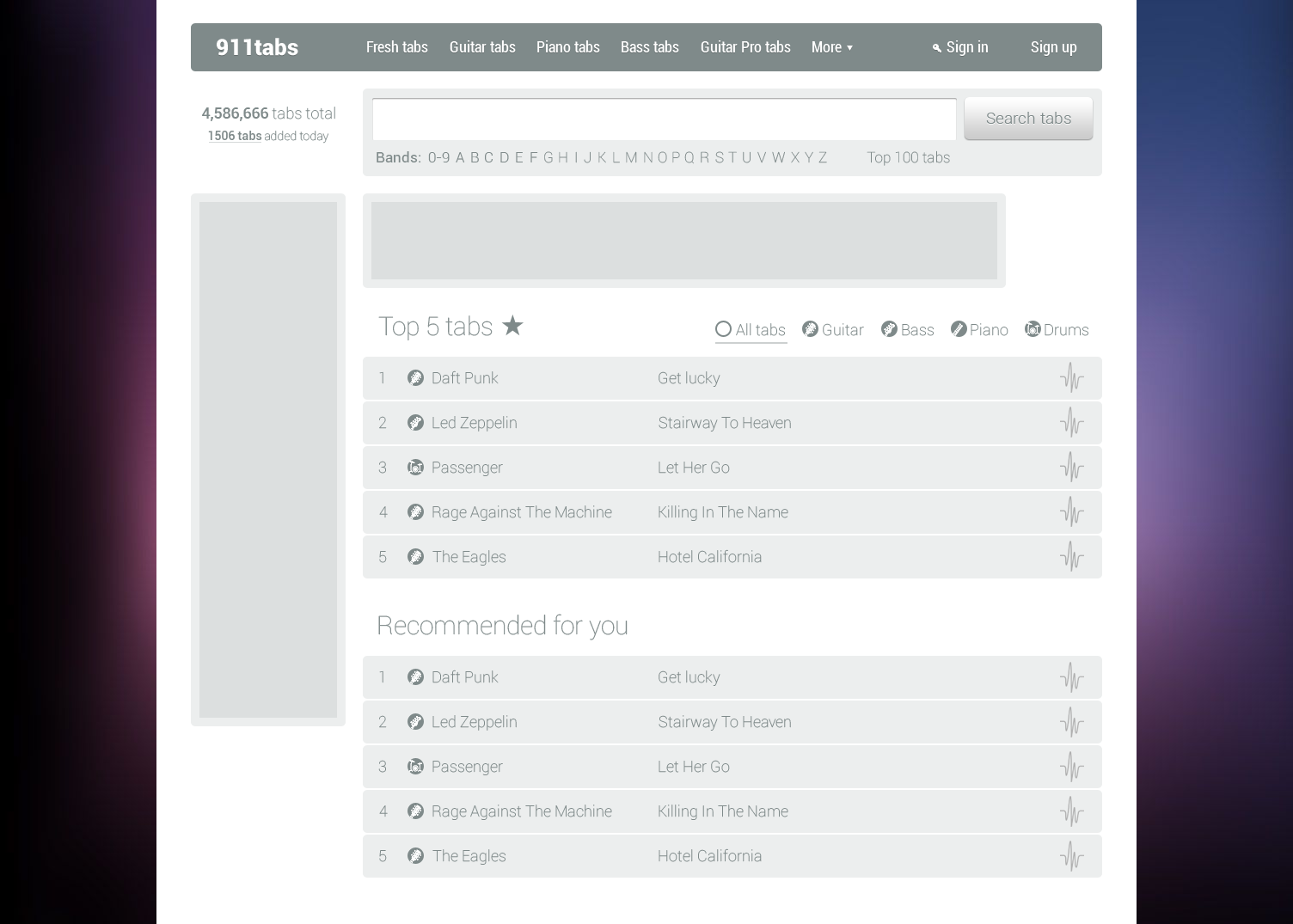
Yeap, prototypes were great, so next step was color them :)
Then we thought about color assosiation with different instrument types:
But it's not that easy to remember and always associate colors with types, moreover with adding new types page would have lots of colors.
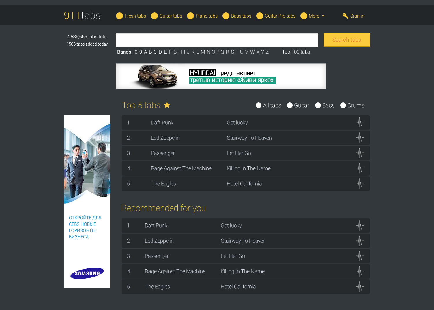
At that moment our designer started to play with background:
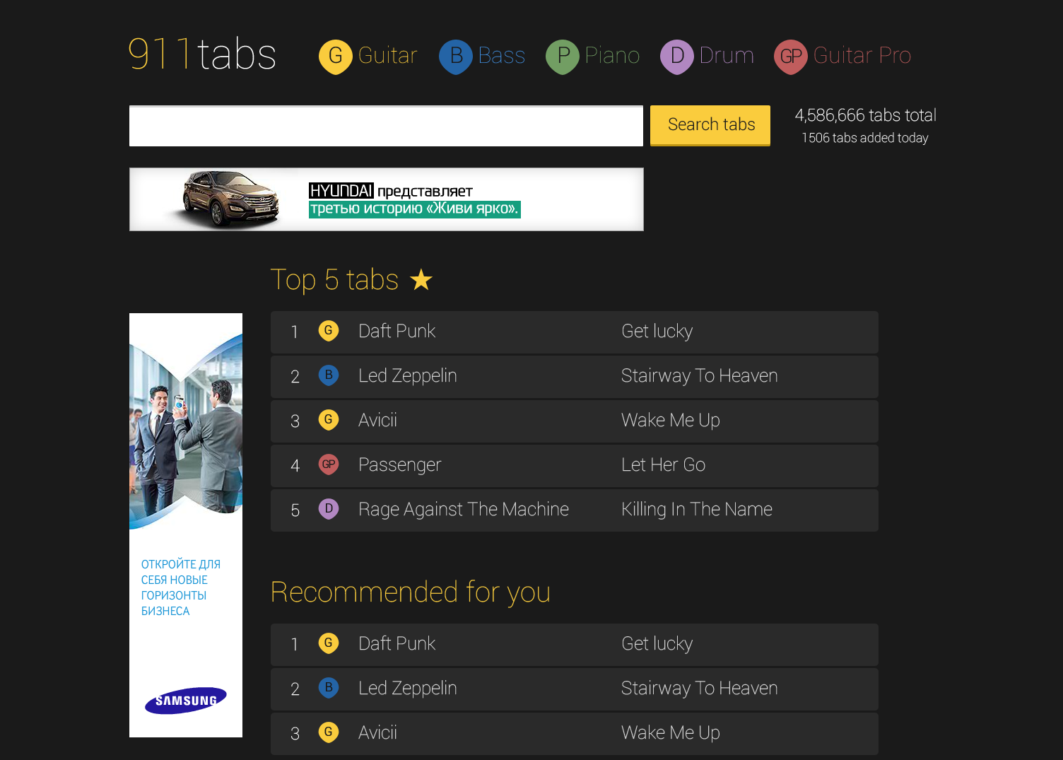
But images would only distract your attention from tabs. Next great idea was: two columns and icons:
As we could not find images for all artists we decided to fill rows with color like Windows 8 Metro style:
And now you see why we did not took yellow or green colors. They are awful! So, 911tabs was colored in Coral. It wasn't fast solution, take a look more about brand colors.
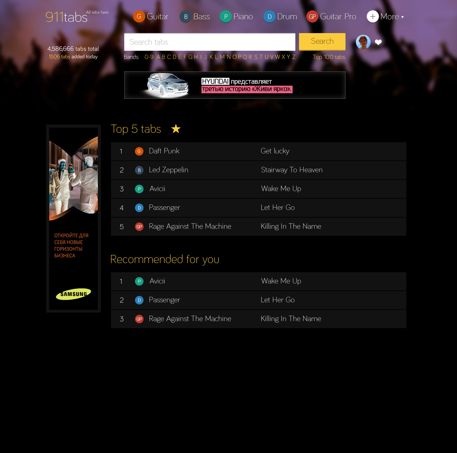
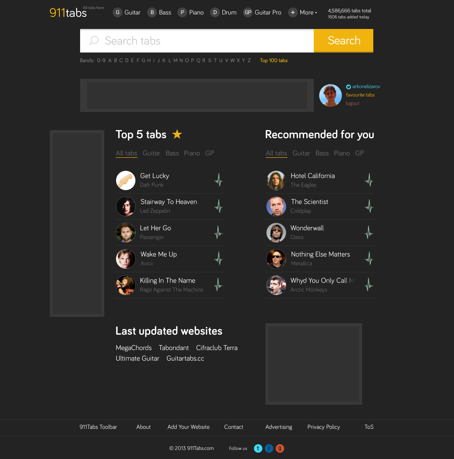
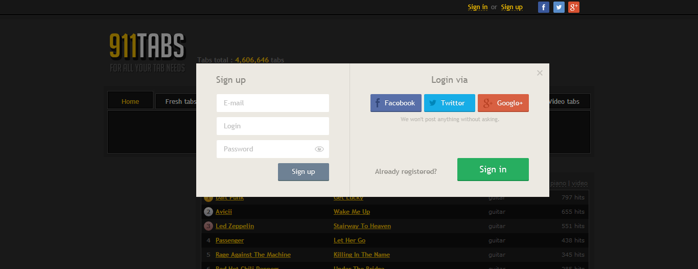
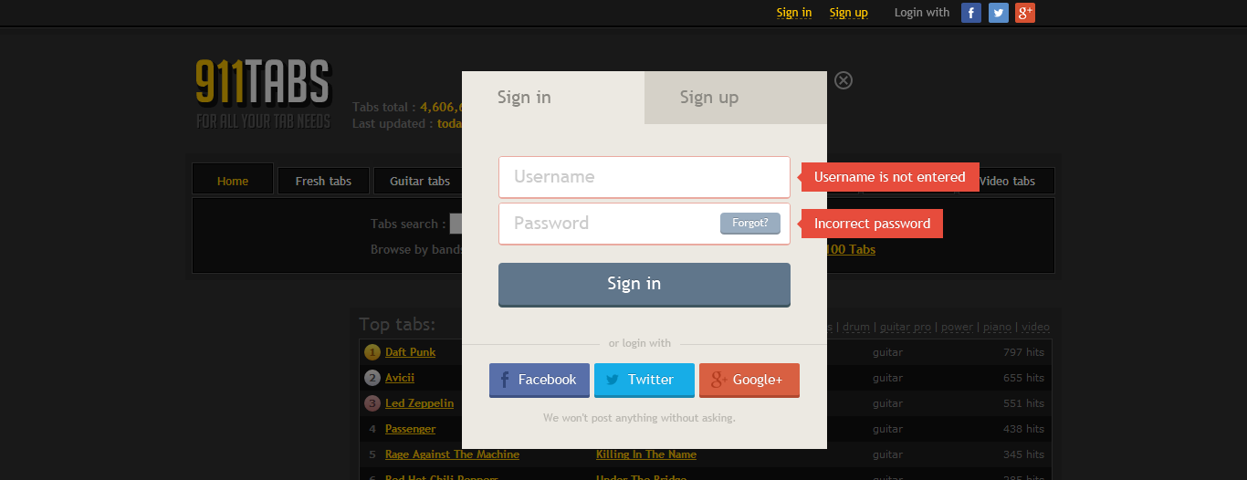
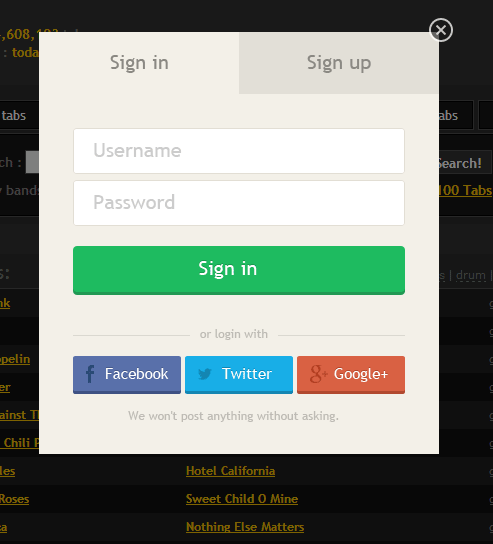
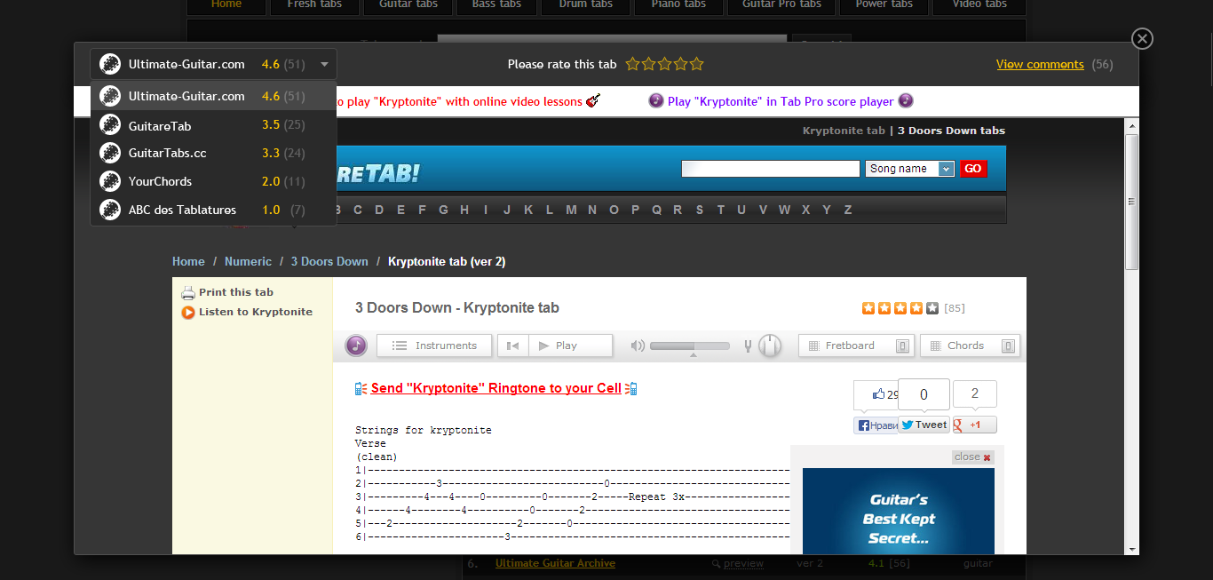
We started to work on authentication in old desing:
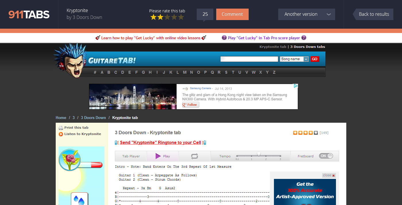
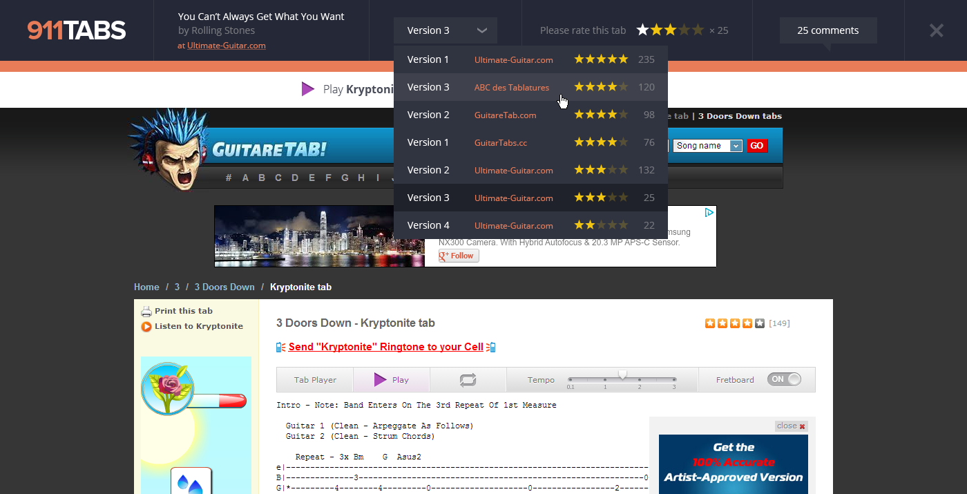
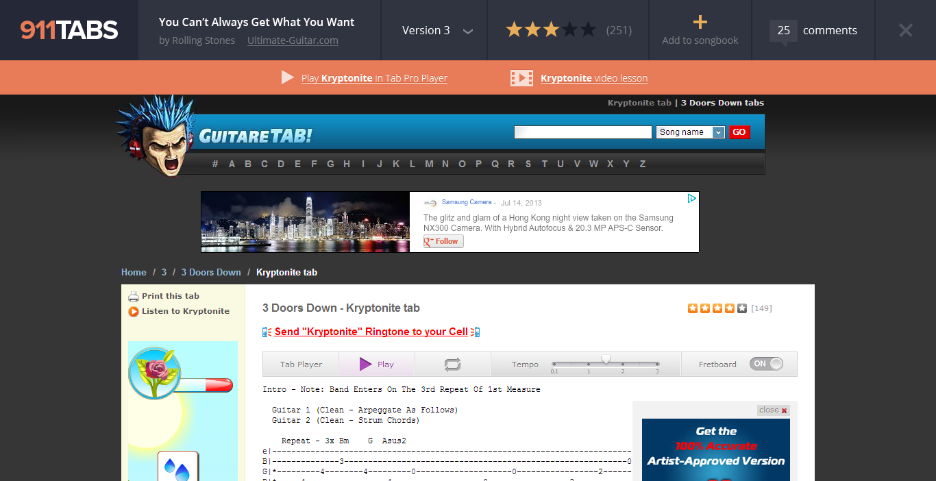
But the biggest discussion was held on tab layout:
How to make great artist page?
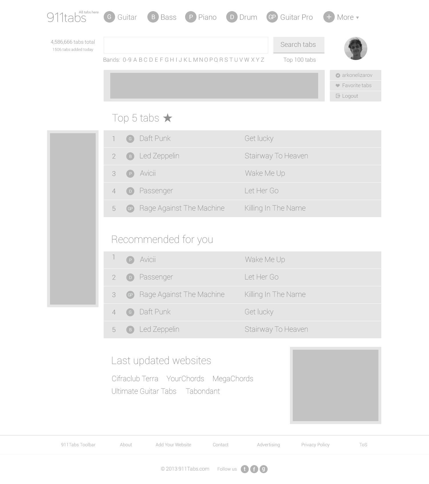
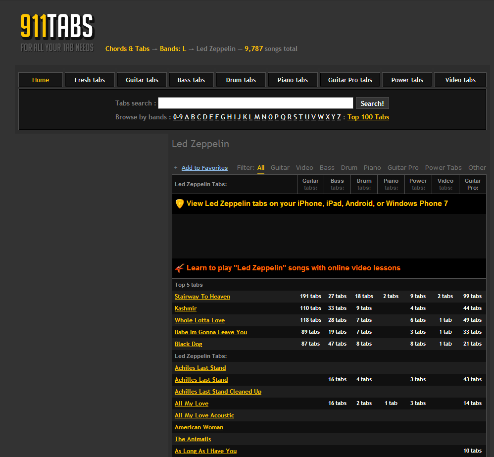
We have a lot of feedbacks about Artist page. Here how it was look like:
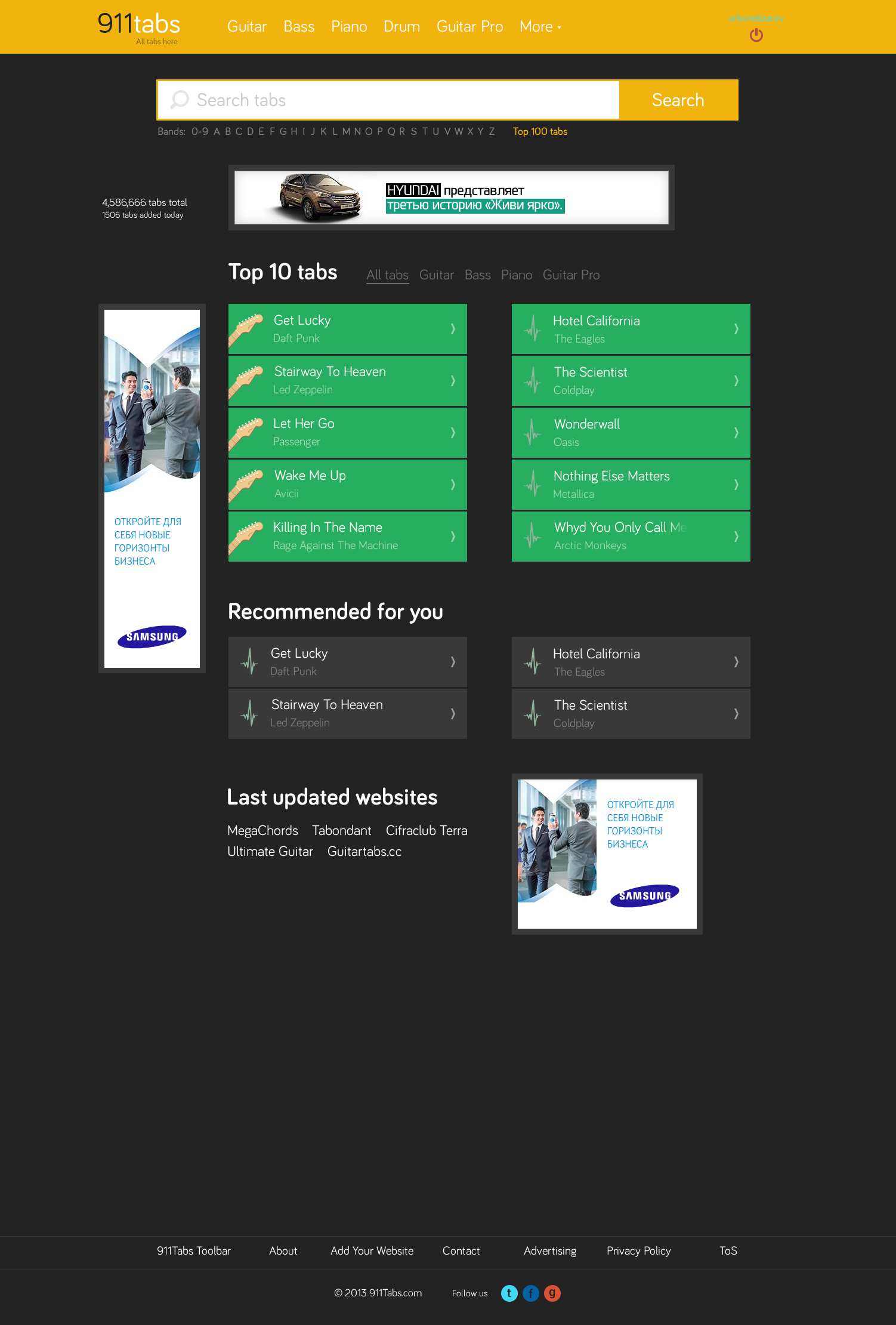
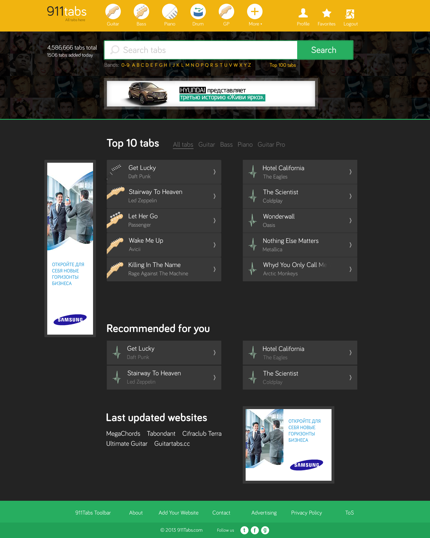
And after redesign:
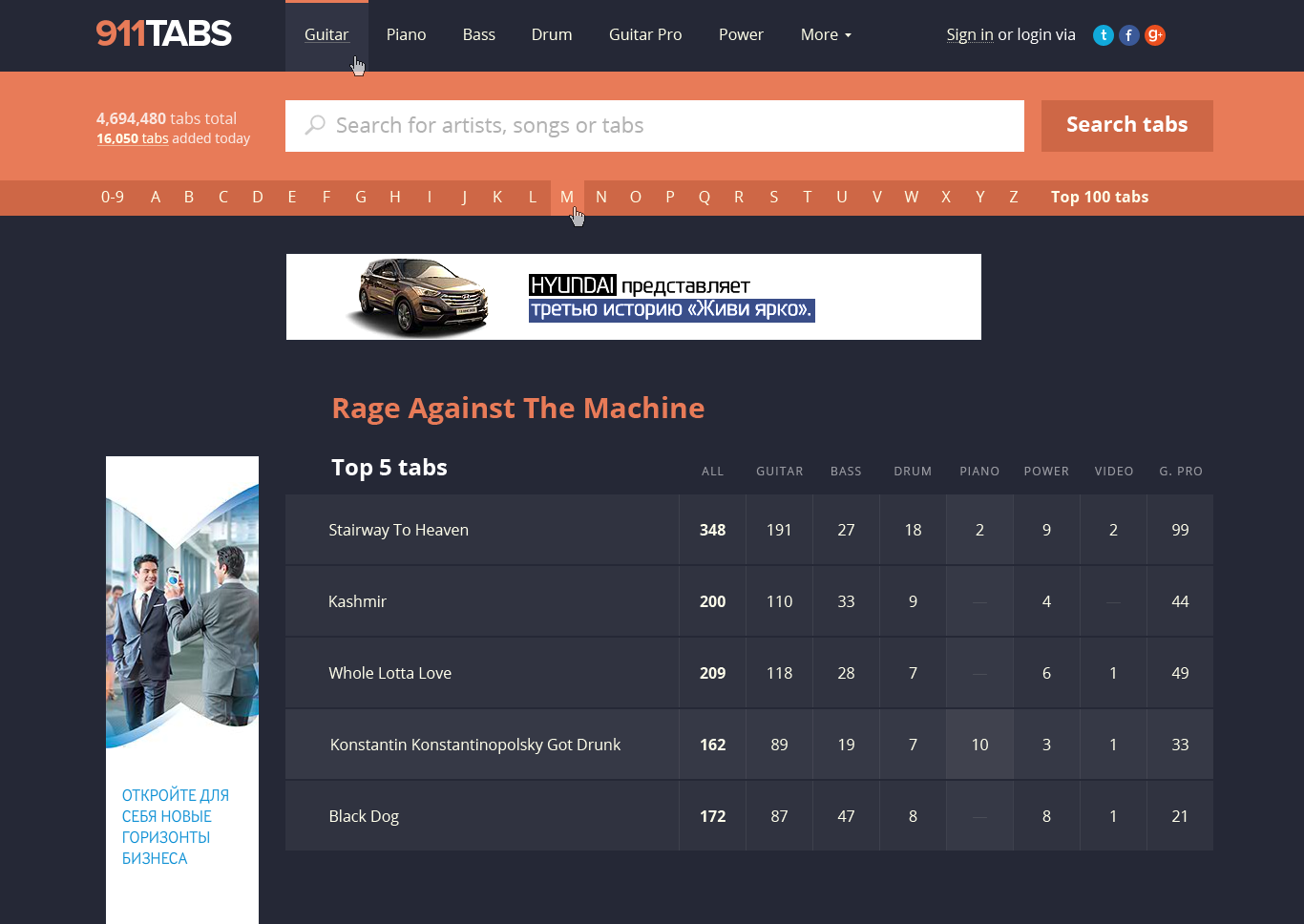
Every cell contains number of tabs for a song in a row, and is clickable.
Redesign was hard but great process, which took 2 months for our team.
Thanks for positive and negative feedbacks:
1. "On the ancient version, I could see 30 tabs at the same time on a page like this (http://www.911tabs.com/tabs/d/david_bowie/watch_that_man_tab.htm#). Now, it's bigger, while I don't think the previous version was hiding any information."
2. "it's a beautiful style and nice and clean, the only disadvantage is that one must scrallen anymore, thus the writing is larger,"
3. "The new layout is seemingly more feature filled, but is harder to read through larger amounts of information, such as lists of tabs. everything seems too big and spaced apart."
4. "I like the new site layout, it's much cleaner than the old one. Good work."
5. "i have no idea who is your designer but please fired him. i am sure he/she has some hormonal issues + a medical condition in his/her eyes (possible problem: blindness). Really you are better, way better than this."
Thanks all!
We are always want your feedbacks, so contact us.